My Role
Usability Testing
Interaction Design
team
Alaa Shihab
Arcadia Calimano
Jolie Ren
Rae Kim
Timeline
March – May 2026
2 months
OUTCOME
Designs adopted by the MedLaunch team
The Challenge
Transforming an In-Progress Compliance Tool into a Complete, Usable product
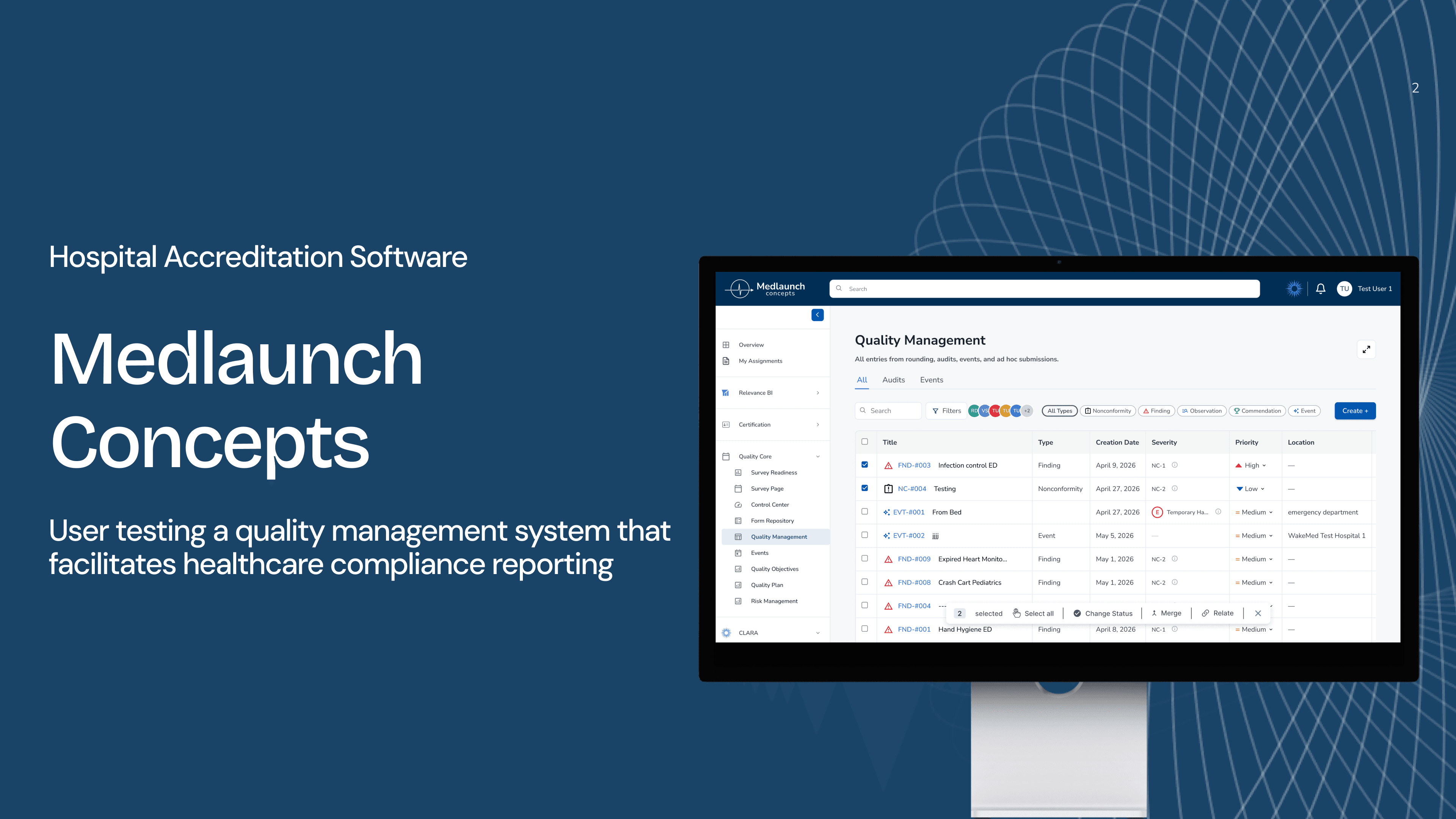
MedLaunch Concepts builds software for hospital accreditation, compliance, and quality management, workflows that healthcare professionals have described as especially tedious. Their Quality Management page lets users document compliance issues, manage corrective actions, link records, and report safety events.
We were brought in as a four-person usability team from the DX Center at Pratt Institute to evaluate the platform while it was still actively under development. Our goal was to detect friction points in the website’s usability before it ships.
initial consult
Prioritizing Key Features
We began with a kick-off meeting with the MedLaunch team to understand the product, its users, and the workflows they were most concerned about. From the consult, we learned that the Quality Management page was the most actively used and least-documented section of the product. Due to time constraints and the depth of each product, we decided to work on this page to yield the highest impact results.
usability testing findings
Straightforward, Learnable Product, but Could Better Assist Users
My team and I conducted eight remote moderated user tests with MedLaunch’s prototypes and identified the following key issues for improvement:
Improvement 01.
Access to Side Panel Contents
Improvement 02.
Redesign Merge Functionality
Improvement 03.
Add “Other” Option for Edge Cases
Improvement 01.
Access to Side Panel Contents
Only 12.5% of participants located the "Start Effectiveness Monitoring" button for an existing issue. There was no visual affordance indicating that the table scrolled.

1: Lack of scroll indicator - No visible scrollbar to indicate the table is horizontally scrollable.
2: Hidden off-screen content - "Start Monitoring" button only reachable by scrolling horizontally.
"I had no idea this was already over here. Normally, if you want me to scroll over, there's a box here that tells me to scroll over."
-Participant 2, Healthcare Administrator
redesign
Add a Visible Horizontal Scroll Bar and Expand the Panel Width
To reduce confusion, we added a horizontal scroll bar and allowed the user to expand the panel width, allowing the user better access to the options presented in the side panel.

1: Wide Side Panel - Opening an entry ticket expands the side panel into a wider, adjustable view for easier access to key elements.
2: Horizontal Scroll Bar- allows users to drag across the Actions table to reach hidden buttons.
Improvement 02.
Redesign Merge Functionality
Users were unsure whether they had merged in the correct direction.
redesign
Clarify Merge Directionality and Update Terminology in the Side Panel
We revised the flow to better match users’ mental model and reduce directionality confusion. We changed “Merged Into” into “Merge,” since the current ticket would be treated as the primary record, and “Relates to” to “Relate,” so it reads as an action rather than an existing status. These changes clarify the distinction between the two actions.
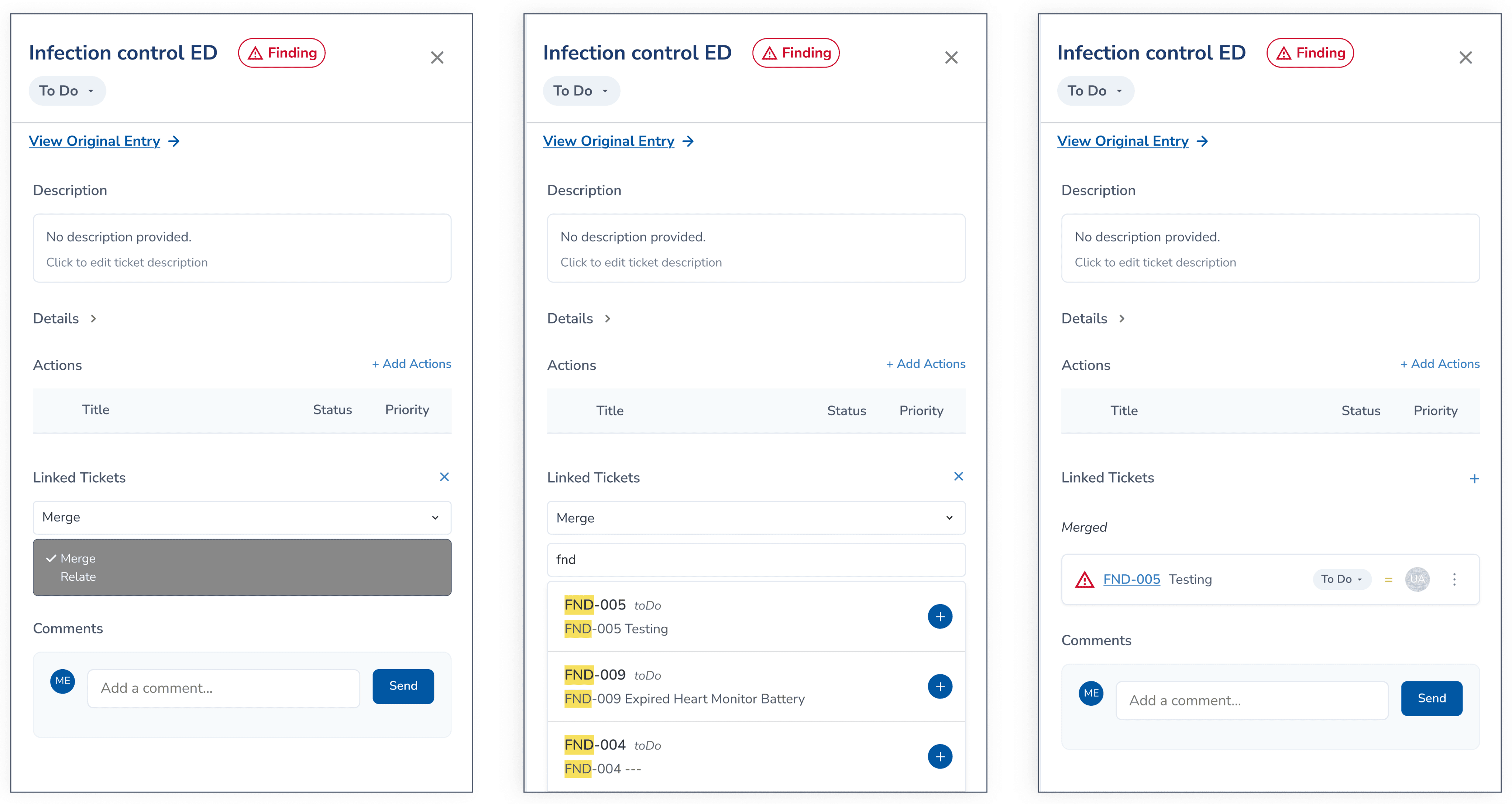
Proposed Merge Flow from Primary Ticket:
Select action on the primary record > Search and select the sub ticket > Confirmed
Bulk Action Toolbar
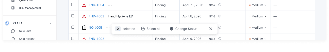
The merge action conflicted with users’ mental model, as several participants expected to use the checkboxes to select tickets and merge them from the bottom action bar.
“I know if I’m going to merge records, it’s probably something to do with these checkboxes here on the side.”
-Participant 8, Software Engineer
old design
Users expected a merge option in the bulk action toolbar.
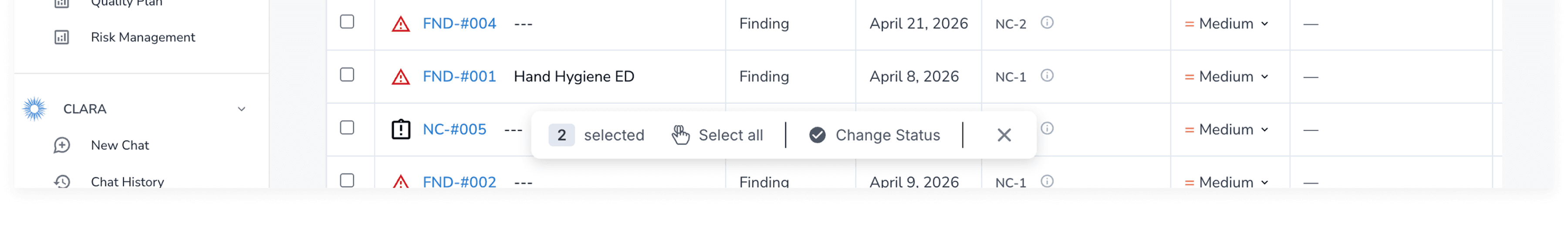
new design


Allow users to merge by simply selecting tickets.
1: Give user control with arranging ticket order.
2: Confirm merge with a warning indication,
giving the user feedback.
Improvement 03.
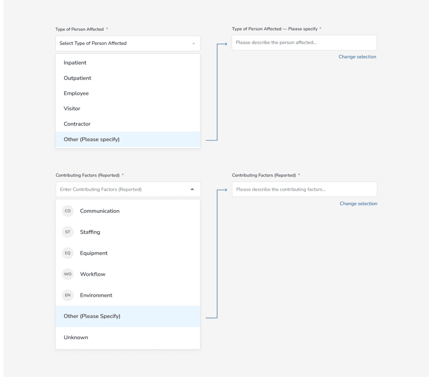
Add “Other” Option for Edge Cases in the Event Form
The form does not always give users clear or complete choices, making it harder to report healthcare events accurately. Several participants reported that some information may not be known ahead of time, making completing the event form unintuitive.
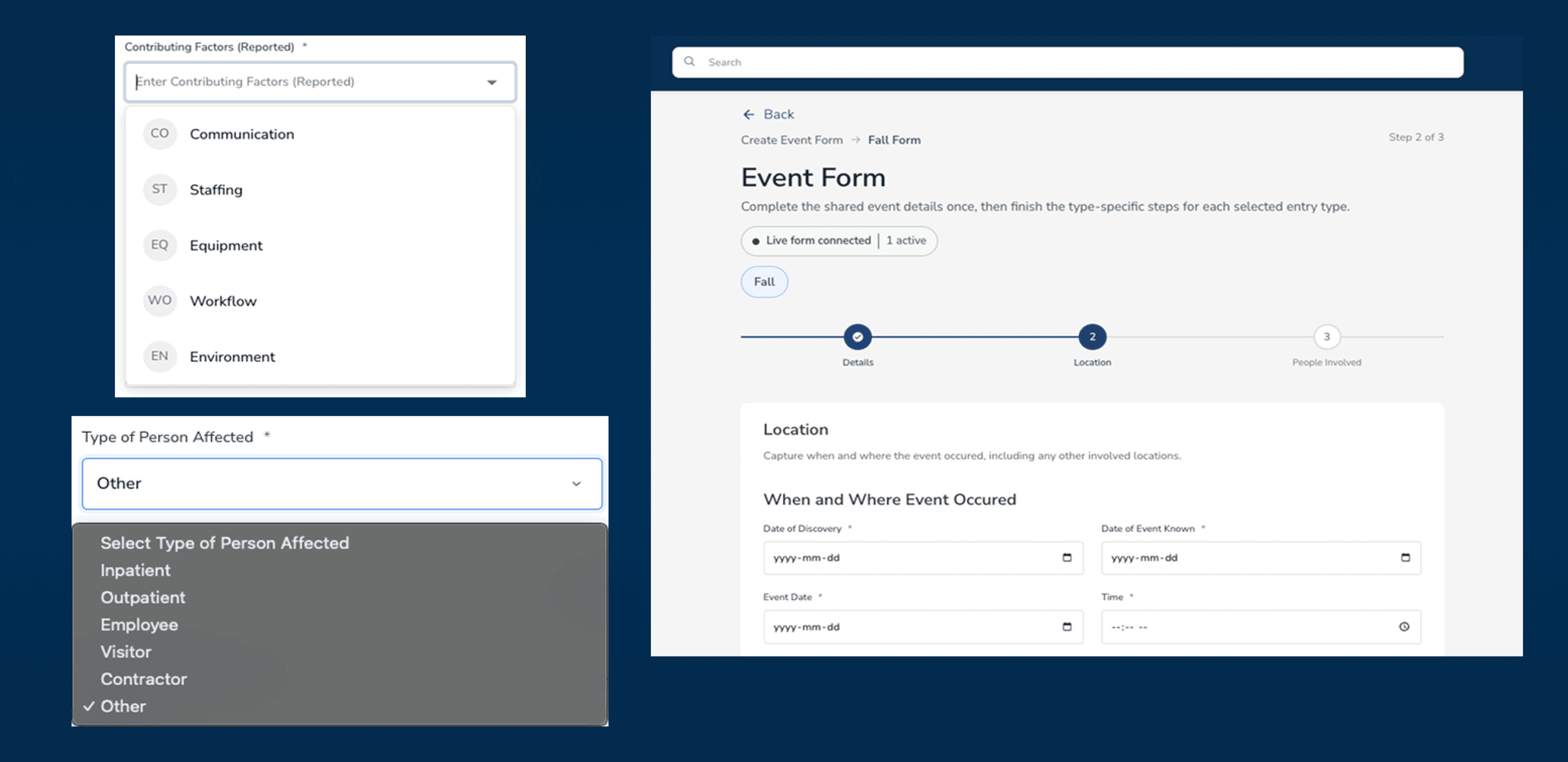
“You won’t know all this information unless you’re working with a patient.”
-Participant 7, Hospital Surveyor
redesign
Add Flexible Input Options for Unclear Cases
Expand the Input Field and add “Other” and “Unknown” options so that users can account for edge cases more accurately. Users would be able to select “Unknown” when not every piece of information is clearly available, as well as account for edge-case scenarios where they would be able to specify certain details on a deep level.

outcome
Implementation by the MedLaunch Concepts Team
After we presented the designs, the MedLaunch team were ecstatic with the results, and began implementing the designs to the Quality Management page. The improvements are making their way into production and will be rolling out to their customer base soon.
“The team brought sharp UX research and design thinking to our platform. These are flows our hospital customers rely on daily, and getting them right matters.”
-Product Manager, MedLaunch Concepts
reflections
Lessons For Moving Forward
Making a complex system understandable
The hardest design challenge was isolating which part of a complex system caused each failure. The think-aloud protocol was essential to reveal user pain points. Without hearing users reason through their choices in real time, we would have misread hesitation as confusion rather than a mismatch between the interface and users’ mental models.
Prioritizing for impact in a short time frame
Our data from remote user testing gave MedLaunch a roadmap to prioritize designs for the largest impact. The 12.5% pass rate in the side panel usability issue made the client aware that this aspect of the page should be prioritized foremost.
My Role
Usability Testing
Interaction Design
team
Alaa Shihab
Arcadia Calimano
Jolie Ren
Rae Kim
Timeline
March – May 2026
2 months
OUTCOME
Designs adopted by the MedLaunch team
The Challenge
Transforming an In-Progress Compliance Tool into a Complete, Usable product
MedLaunch Concepts builds software for hospital accreditation, compliance, and quality management, workflows that healthcare professionals have described as especially tedious. Their Quality Management page lets users document compliance issues, manage corrective actions, link records, and report safety events.
We were brought in as a four-person usability team from the DX Center at Pratt Institute to evaluate the platform while it was still actively under development. Our goal was to detect friction points in the website’s usability before it ships.
initial consult
Prioritizing Key Features
We began with a kick-off meeting with the MedLaunch team to understand the product, its users, and the workflows they were most concerned about. From the consult, we learned that the Quality Management page was the most actively used and least-documented section of the product. Due to time constraints and the depth of each product, we decided to work on this page to yield the highest impact results.
usability testing findings
Straightforward, Learnable Product, but Could Better Assist Users
My team and I conducted eight remote moderated user tests with MedLaunch’s prototypes and identified the following key issues for improvement:
Improvement 01.
Access to Side Panel Contents
Improvement 02.
Redesign Merge Functionality
Improvement 03.
Add “Other” Option for Edge Cases
Improvement 01.
Access to Side Panel Contents
Only 12.5% of participants located the "Start Effectiveness Monitoring" button for an existing issue. There was no visual affordance indicating that the table scrolled.
1: Lack of scroll indicator - No visible scrollbar to indicate the table is horizontally scrollable.
2: Hidden off-screen content - "Start Monitoring" button only reachable by scrolling horizontally.
"I had no idea this was already over here. Normally, if you want me to scroll over, there's a box here that tells me to scroll over."
-Participant 2, Healthcare Administrator
redesign
Add a Visible Horizontal Scroll Bar and Expand the Panel Width
To reduce confusion, we added a horizontal scroll bar and allowed the user to expand the panel width, allowing the user better access to the options presented in the side panel.
1: Wide Side Panel - Opening an entry ticket expands the side panel into a wider, adjustable view for easier access to key elements.
2: Horizontal Scroll Bar- allows users to drag across the Actions table to reach hidden buttons.
Improvement 02.
Redesign Merge Functionality
Users were unsure whether they had merged in the correct direction.
redesign
Clarify Merge Directionality and Update Terminology in the Side Panel
We revised the flow to better match users’ mental model and reduce directionality confusion. We changed “Merged Into” into “Merge,” since the current ticket would be treated as the primary record, and “Relates to” to “Relate,” so it reads as an action rather than an existing status. These changes clarify the distinction between the two actions.
Proposed Merge Flow from Primary Ticket:
Select action on the primary record > Search and select the sub ticket > Confirmed
Bulk Action Toolbar
The merge action conflicted with users’ mental model, as several participants expected to use the checkboxes to select tickets and merge them from the bottom action bar.
“I know if I’m going to merge records, it’s probably something to do with these checkboxes here on the side.”
-Participant 8, Software Engineer
old design
Users expected a merge option in the bulk action toolbar.
new design
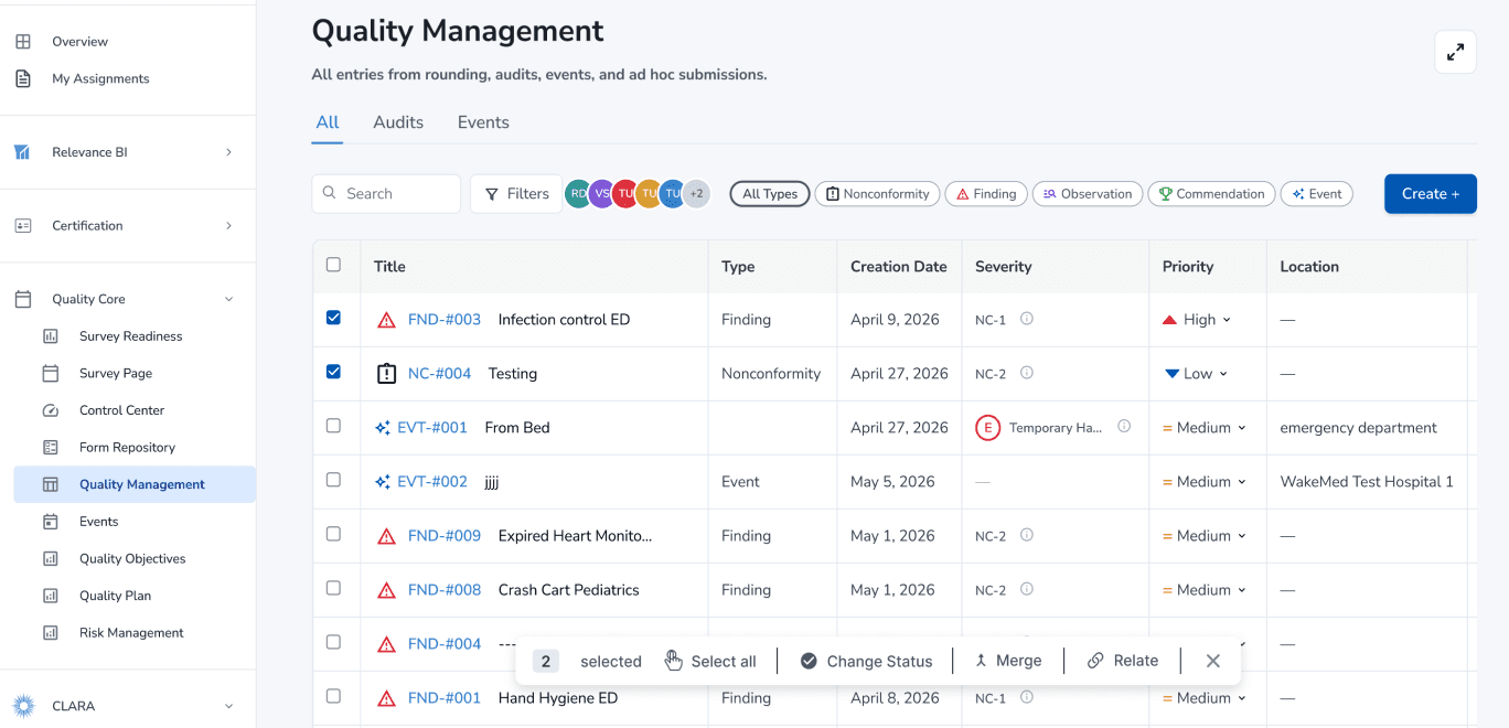
Allow users to merge by simply selecting tickets.

1: Give user control with arranging ticket order.
2: Confirm merge with a warning indication,
giving the user feedback.
Improvement 03.
Add “Other” Option for Edge Cases in the Event Form
The form does not always give users clear or complete choices, making it harder to report healthcare events accurately. Several participants reported that some information may not be known ahead of time, making completing the event form unintuitive.

“You won’t know all this information unless you’re working with a patient.”
-Participant 7, Hospital Surveyor
redesign
Add Flexible Input Options for Unclear Cases
Expand the Input Field and add “Other” and “Unknown” options so that users can account for edge cases more accurately. Users would be able to select “Unknown” when not every piece of information is clearly available, as well as account for edge-case scenarios where they would be able to specify certain details on a deep level.
outcome
Implementation by the MedLaunch Concepts Team
After we presented the designs, the MedLaunch team were ecstatic with the results, and expressed interest in implementing the designs to the Quality Management page. The improvements are making their way into production and will be rolling out to their customer base soon.
“The team brought sharp UX research and design thinking to our platform. These are flows our hospital customers rely on daily, and getting them right matters.”
-Product Manager, MedLaunch Concepts
reflections
Lessons For Moving Forward
Making a complex system understandable
The hardest design challenge was isolating which part of a complex system caused each failure. The think-aloud protocol was essential to reveal user pain points. Without hearing users reason through their choices in real time, we would have misread hesitation as confusion rather than a mismatch between the interface and users’ mental models.
Prioritizing for impact in a short time frame
Our data from remote user testing gave MedLaunch a roadmap to prioritize designs for the largest impact. The 12.5% pass rate in the side panel usability issue made the client aware that this aspect of the page should be prioritized foremost.