

APPetite: Designing a Dining Cashback App from 0-to-1
APPetite: Designing a Dining Cashback App from 0-to-1
———————————————————————————————————————————
——————————————————————
—————————————————————————————————————
Duration:
9 weeks
Team:
Debodyuti Biswas
Julie Vo
Jolie Ren
My Contributions:
User Research
Prototyping
Design Strategy
Tools:
Figma
Miro
Duration:
Duration:
9 weeks
Team:
Team:
Debodyuti Biswas
Julie Vo
Jolie Ren
My Contributions:
My Contributions:
User Research
Prototyping
Design Strategy
Tools:
Tools:
Figma
Miro
Design Overview
———————————————————————————————————————————
APPetite is an app that helps users access their dining cashback rewards all in one spot. Rewards are automatically applied, and users can easily find the deal when they are checking out their food purchases.
Design Overview
———————————————————
APPetite is an app that helps users access their dining cashback rewards all in one spot. Rewards are automatically applied, and users can easily find the deal when they are checking out their food purchases.
Design Overview
—————————————————————————————————————
APPetite is an app that helps users access their dining cashback rewards all in one spot. Rewards are automatically applied, and users can easily find the deal when they are checking out their food purchases.
The Problem
———————————————————————————————————————————
Users want a way to use cashback rewards without having to scramble through their banking apps and keep track of expiration dates. Overall, our following insights motivated me to design an app that is built on convenience and personalization.
The Problem
———————————————————
Users want a way to use cashback rewards without having to scramble through their banking apps and keep track of expiration dates. Overall, our following insights motivated me to design an app that is built on convenience and personalization.
The Problem
—————————————————————————————————————
Users want a way to use cashback rewards without having to scramble through their banking apps and keep track of expiration dates. Overall, our following insights motivated me to design an app that is built on convenience and personalization.
User Research
———————————————————————————————————————————
First, I interviewed three users who were young adults in their mid-late 20s, carried multiple credit cards, and often used cashback rewards while eating out. Here are some of the responses that were given by my interviewees:
“I try to remember which card gives the best cashback at which place, but I mess it up and pay with the wrong one.”
“I’ll look for a reward, but it takes me so long to get to it that I just pull out the nearest card. I wish I could see the rewards more easily.”
“Everything feels scattered. I have Capital One, Chase, Amex, and Citi, each with its own app. I forget what’s where, get frustrated, and sometimes give up.”
User Research
———————————————————
First, I interviewed three users who were young adults in their mid-late 20s, carried multiple credit cards, and often used cashback rewards while eating out. Here are some of the responses that were given:
“I try to remember which card gives the best cashback at which place, but I mess it up and pay with the wrong one.”
“I’ll look for a reward, but it takes me so long to get to it that I just pull out the nearest card. I wish I could see the rewards more easily.”
“Everything feels scattered. I have Capital One, Chase, Amex, and Citi, each with its own app. I forget what’s where, get frustrated, and sometimes give up.”
User Research
—————————————————————————————————————
First, I interviewed three users who were young adults in their mid-late 20s, carried multiple credit cards, and often used cashback rewards while eating out. I wanted to learn more about:
Users’ purchase and saving decision-making when making a food purchase
Pain points users may encounter while trying to save money and navigate through banking apps
How users keep track of their cashback rewards.
Here are some of the responses that were given by my interviewees:
“I try to remember which card gives the best cashback at which place, but I mess it up and pay with the wrong one.”
“I’ll look for a reward, but it takes me so long to get to it that I just pull out the nearest card. I wish I could see the rewards more easily.”
“Everything feels scattered. I have Capital One, Chase, Amex, and Citi, each with its own app. I forget what’s where, get frustrated, and sometimes give up.”

Competitive Analysis
———————————————————————————————————————————
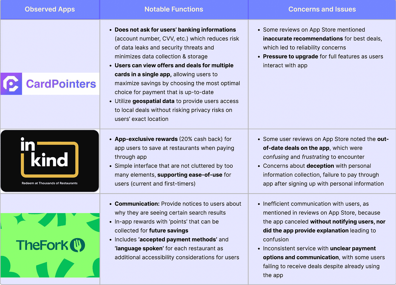
I conducted a competitive analysis to confirm that our app design was unique. Based on these interests, I chose to engage with 3 similar apps: CardPointers, InKind, and The Fork.
Reflecting on our findings, there is no single solution that uniquely addresses the features and concerns that meet our users’ needs. My design was built on location and situational intelligence, whereas existing designs were centered around the card rewards themselves.
Competitive Analysis
———————————————————
I conducted a competitive analysis to confirm that our app design was unique. Based on these interests, I chose to engage with 3 similar apps: CardPointers, InKind, and The Fork.
Reflecting on our findings, there is no single solution that uniquely addresses the features and concerns that meet our users’ needs. My design was built on location and situational intelligence, whereas existing designs were centered around the card rewards themselves.
Competitive Analysis
—————————————————————————————————————
I conducted a competitive analysis to confirm that our app design was unique. Based on these interests, I chose to engage with 3 similar apps: CardPointers, InKind, and The Fork.
Reflecting on our findings, there is no single solution that uniquely addresses the features and concerns that meet our users’ needs. My design was built on location and situational intelligence, whereas existing designs were centered around the card rewards themselves.
Finally, I devised the design goal:
Create an app that enables users to more easily use their best available dining cashback offers during checkout, and allow credit card users to search for rewards based on location.
Finally, I devised the design goal:
Create an app that enables users to more easily use their best available dining cashback offers during checkout, and allow credit card users to search for rewards based on location.




Home/Maps
Gives the user the most convenient way to search and use their cash back rewards for restaurants on the go, taking advantage of situational intelligence in our design.
Savings
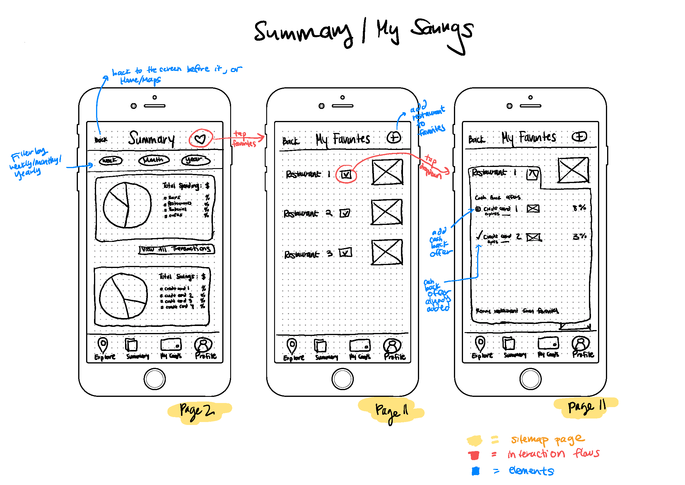
Users could see their savings progress and a list of transactions.
Cards
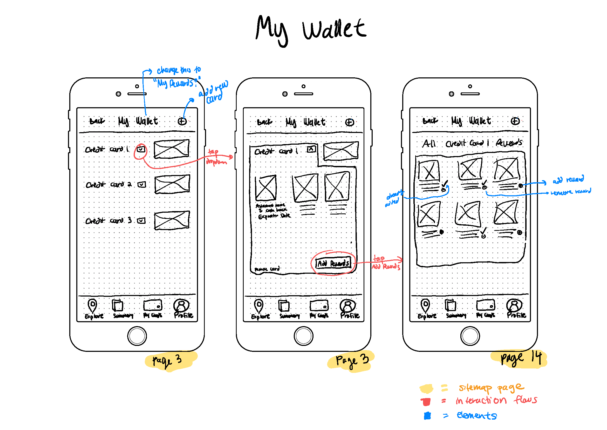
Users’ cash back rewards are automatically added after linking their bank account(s), saving the headache of having to search within each banking app and add the reward manually.
Ideation: Wireframes
———————————————————————————————————————————
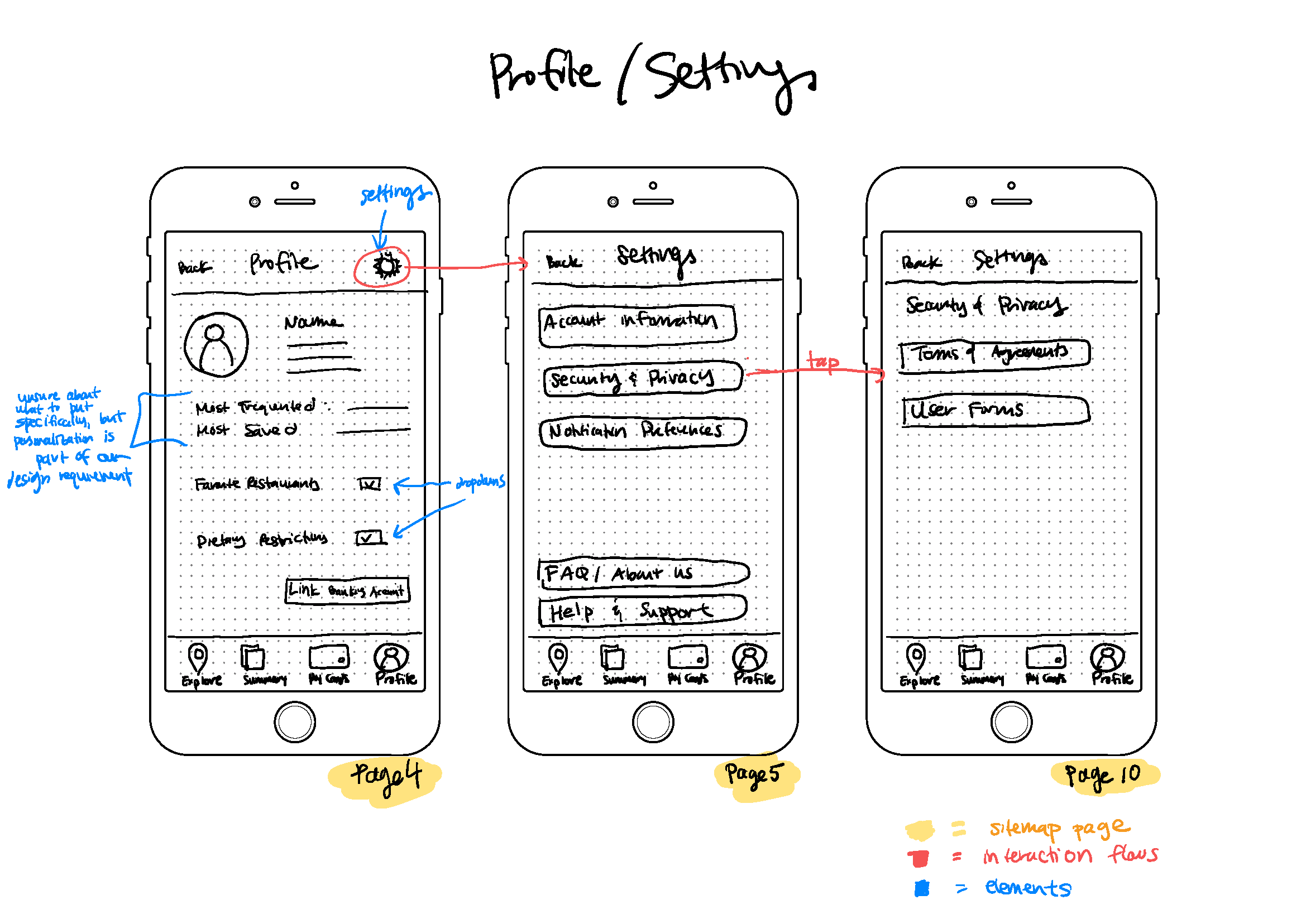
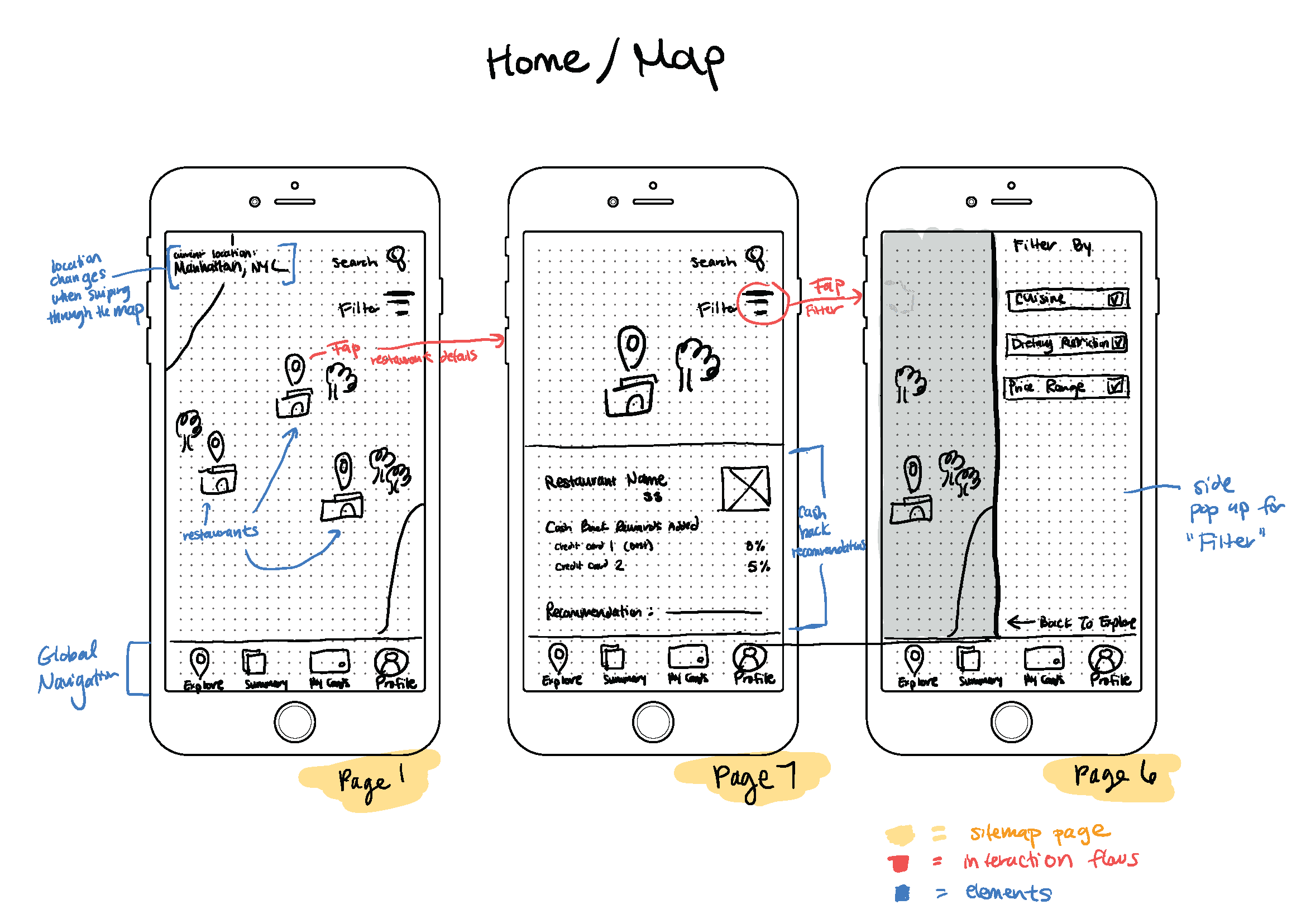
Here are the wireframes that I sketched, based on my design goals and features that we’ve delineated above. I chose to focus on the following main pages for the app’s global navigation:
Ideation: Wireframes
———————————————————
Here are the wireframes that I sketched, based on my design goals and features that we’ve delineated above. I chose to focus on the following main pages for the app’s global navigation:
Ideation: Wireframes
———————————————————————————————
Here are the wireframes that I sketched, based on my design goals and features that we’ve delineated above. I chose to focus on the following main pages for the app’s global navigation:
Branding
———————————————————————————————————————————
I spent time building a fresh, modern color palette— purple, green, and orange — to design our app. After researching trends that were popular among users in our demographic, I came up with the branding guidelines below:
Branding
———————————————————
I spent time building a fresh, modern color palette— purple, green, and orange — to design our app. After researching trends that were popular among users in our demographic, I came up with the branding guidelines below:
Branding
—————————————————————————————————————
I spent time building a fresh, modern color palette— purple, green, and orange — to design our app. After researching trends that were popular among users in our demographic, I came up with the branding guidelines below:
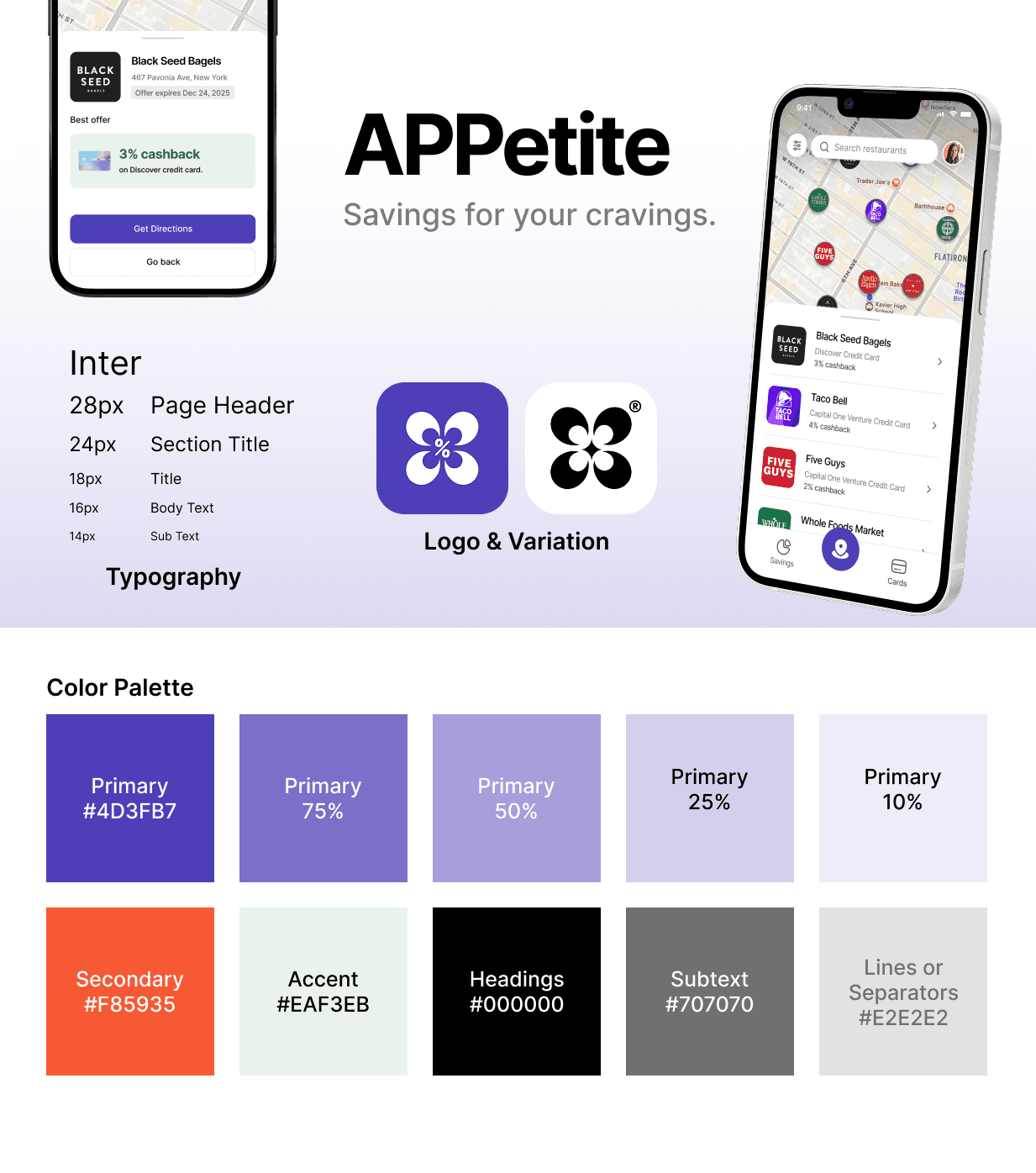

In our logo, I wanted to capture the ideas of “savings,” “cashback,” and “dining.” The logo displays four chairs around a percent sign, representing diners sitting at a table, in the shape of a clover, representing good fortune.
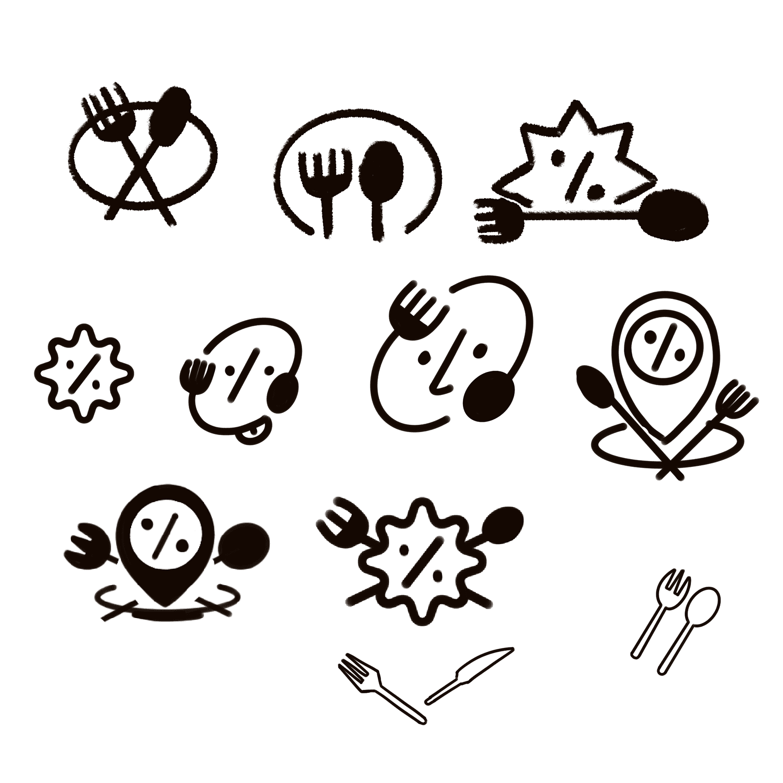
Here were some of the rejected logo ideas that didn’t quite fit the mood I wanted to capture with APPetite:

Usability Testing and Feedback
———————————————————————————————————————————
We conducted usability testing with our hi-fi prototypes on two individuals in their mid-20s. In our tests, we were looking to see if users were able to complete the task flow in accessing their rewards, based on their real-time location. We were curious if there were other pain points that we may have missed in our research. Here were the results:
Usability Testing and Feedback
———————————————————
We conducted usability testing with our hi-fi prototypes on two individuals in their mid-20s. In our tests, we were looking to see if users were able to complete the task flow in accessing their rewards, based on their real-time location. We were curious if there were other pain points that we may have missed in our research. Here were the results:
Usability Testing and Feedback
——————————————————————————————————
We conducted usability testing with our hi-fi prototypes on two individuals in their mid-20s. In our tests, we were looking to see if users were able to complete the task flow in accessing their rewards, based on their real-time location. We were curious if there were other pain points that we may have missed in our research. Here were the results:
Participant 1:
Noted the intuitiveness of their experience: the interfaces were easy to follow, and they felt compelled to engage with the interfaces further.
Found the visualization at the top of the screen in the ‘Savings’ page useful because it provided quick insights into their transaction activities. They noted that the banking apps don’t have such visualizations upfront, which would take them more time to find.
Participant 2:
Was particularly interested in the visualizations on the ‘Savings’ page: seeing graphs that summarize spending details quickly gave them insights into saving activities.
Highlighted the importance of visual contrast in the graphs and the facets across interfaces: stronger contrast between items that are close to each other helped them stand out more.
Overall, both participants noted the abundance of contextual information for each page, which was engaging but not overwhelming or disruptive.
Overall, both participants noted the abundance of contextual information for each page, which was engaging but not overwhelming or disruptive.
Final Solution
———————————————————————————————————————————
Final Solution
———————————————————
Final Solution
—————————————————————————————————————-
All your dining rewards, right on the map.
APPetite automatically links your existing card offers and shows them on the map.
Rewards are grouped by urgency, and deals expiring soon are prioritized.
Your cards are ranked based on how much you saved, and easily visualize your spending and savings.